Tuesday 4 December 2012

Task 4: IPC Case Study


IPC Media produces over 85 iconic media brands, with their print brands alone reaching almost two thirds of UK women and 44% of UK men – almost 27 million UK adults – while their online brands collectively reach 20 million users every month.


Background History:

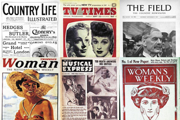
In 1963 three of the UK’s leading magazine publishers, George Newnes, Odhams Press and Fleetway Publications, came together to form The Interantional Publishing Corporation (IPC). Then in 1968 IPC magazines were created.Some of the first few magazines from this company were; The Field, Country Life, Woman’s Weekly, TV Times and New Musical Express (NME).

Structure:

Recently IPC have re-structured their intended audiences to men, up-market women and mass-market women.
- IPC Inspire will be the mens magazines. These will include music brands, mens lifestyle and leisure pursuits.
- IPC Connect will be the mass-market women's magazines. These will include women's weeklies, TV entertainment brands and the GoodToKnow network.
- IPC Southbank will be the up-market women's magazines. These will include the beauty, fashion and home interest brands.

Current News:

- NME celebrates 60th anniversary with a special collectors edition of the magazine.
- Woman’s Own marks 80th anniversary with a special issue.
- Marie Claire magazine launches a multi-platform careers initiative to inspire woman to achieve the job of their dreams.
- The first release of NRS PADD data confirms that IPC Media is the UKs leading cross platform publisher.


Over the years the types of magazines that IPC Media has produced has varied, they create magazines that will generally appeal to most people; NME, TV Times, Woman's Weekly for example. However, some of the magazines produced are made for a niche audience such as; Amateur Gardening, Amateur Photography, Golf Monthly and Cycling Weekly for example, these types of magazines are produced to be targeted at the small niche of people interested in the subject. IPC Media have targeted some of their magazines at countrymen and people with an interest in the countryside; The Field was once known as the largest magazine in Europe. Other countryside related magazines are; Shooting Times, Shooting Gazette and Country Life. Another major type of magazine that IPC produce is based around homes, so maybe targeting them at women, housewives. Some of the home magazines IPC produce are; Beautiful Kitchens, Country Homes & Interior, Homes & Gardens, Ideal Home and Style at Home, to name a few.

IPC Media would be an appropriate publisher for a new music magazine as the volumes of sales, collectively that their magazines have produced could insinuate that adding another magazine will only add to the high numbers. NME and UNCUT are the two music magazines that IPC produce, both of these magazines bring in average circulation sales between them, but I think that if IPC were to create more music magazines based around pop music more people will buy into the magazine. NME is one of the UK's most well known music magazines out to introduce and promote new music to its young, indie-targeted audience. NME is the longest published and most respected music weekly in the world. As NME is so respected and has been around for so long they'll have the experience to deal with publishing another music magazine. The amount of unique users that NME has is up to 7.7 million and in comparison UNCUT is up to 87,000 unique users.
I would say that IPC are more likely to create music magazines with a genre of finding and promoting new music. Individual, up and coming music that would be targeted to a young audience. I think the magazines they would create would be successful due to their experience with NME being so well known and popular.
Alternative publishers like Bauer would also be appropriate to create a new music magazine as they own many well known, music related shows, channels, magazines ect. Such as; Q, 4Music, Box Television, Kerrang, Kiss and Magic to name a few. These brands are very popular and used or heard by many, so this shows good experience for creating a new music magazine to compete with their previous creations. Bauer offer 300 different magazines around 15 countries so this shows the volumes of sales they will be able to drum up.

Monday 26 November 2012

Artist/Musician Style

This is a comparison between a variety of music genres and the styles of the artists/musicians and how they convey typically across to the reader. Each genre of magazine has different style conventions which they follow.


Friday 26 October 2012

Task 3: Essay

To what extent should magazines be held responsible for the social ramifications of the representations they offer?

I have found 5 examples from the internet of magazines aimed at teenage girls. I will be talking about the conventions within the front covers of the magazines and whether the magazines themselves should be held responsible for the way teen girls are represented and how it makes them view themselves. The five magazines I chose to look at are; Bliss, Teen Vogue, Sugar, Shout and Teen Now.


To make these magazines appeal to the same audience there needs to be set conventions to guide you into creating the right look of a teenage girl’s magazine. These will include the placement of mastheads, coverlines and images, the celebrities who appear on the front covers all have to have some sort of inspiration or influence on the teenage girls, people who they idolise. The colours used on the entire front cover all need to be similar too.

The colours of the mastheads on all magazines share the same girly and feminine colours; of pinks, purples and turquoises. These colours are also quite faded and not really bright and over the top. All of these colours are stereotypically associated with females and young girls, if you were to look at the front cover of a men’s magazine they would not share the same colour choice as it wouldn’t appeal to them, the men’s colours would have to be dark and masculine. I think pink has been used a lot for the coverlines scattered around the cover, as this again reinforces the idea of being targeted at girls, it also stands out and is clear to read and understand. On Teen Vogue one of the coverlines read ‘Rock your style’ this has been written in pink and below the information taken from the inside article is contrasting the use of girly pinks and purples as it is written in black. I would associate black with a men’s magazine or the inside text of most magazines. The girly colours have been used to make them more attractive and appealing to their intended audience.

Bliss, Teen Vogue, Sugar and Shout look really similar on the front, with the layout of the text and images. In the centre of all of these magazines one image of a female celebrity or model has been placed there. These people will have been chosen to be on the front cover as they are good role models to the teenagers and they will be relevant to the time of publish as they’re releasing something targeted at this age group or these celebrities are idols to the girls. However, on Teen Now the layout is very different. There are many more brightly coloured image and text boxes which can seem unpleasing to the eye; there are more images of celebs on the front although there is still a main focus on one celebrity in particular. It can be hard to find what it is you want to read or see within the magazine as there is so much information; it makes everything unclear and quite messy. Teen Now is the only teenage magazine out of my chosen five to have male celebrities also featured on the front of the magazine.
They are mostly images of relevant boy bands that are loved and crushed upon by many teenage girls so they have also taken into account the fact that girls also have male pin ups. They have been featured innocently unlike females would be featured on a men’s magazine.

I would say that these magazines have a negative effect on girls as they are stereotyping teenage girls, for them all to be into the latest fashion, gossip and boys. However, in reality they are not all like that, not every girl is interested in the same things. It is influencing girls to feel or look a certain way and making them feel self conscious about themselves. There is a coverline that reads ‘Beauty Wars’ this is encouraging girls to turn their looks into a competition to see who is the prettiest, this is making the unconfident girls feel targeted to look or act this way. Also the uses of some of the stories found within the magazines aren’t always appropriate to the age of some of the girls who do read these magazines. One of the stories is about a girl shooting her parents, you could just imagine the gory details and the detailed reasons as to how she came to do such a horrifying thing, this could make some readers feel uncomfortable or maybe get ideas on how to do such crazy things.

I wouldn’t say that magazines are initially all negative, there are positive aspects. Like there are pages with fashion available to keep young girls in the loop of all the latest clothes and accessories, magazines are also used by many to keep up to date with all the celebrity gossip. Teenage magazines always contain some sort of competition where the winner will win such amazing prizes that they may not otherwise be able to afford or obtain. The use of help questionnaires and agony aunt pages within them help girls to relate to each other and to realise that there are others feeling the same way as them.

Magazine publishers should be held responsible for these effects on the teenage girls as it is their fault these airbrushed celebrities appear on the cover to create insecurities that some girls may never have had before. Also the articles can sometimes be really extreme, things that will make girls scared or just find what they’re reading is boring and has no meaning or relevance to them. If I was a magazine publisher I think I wouldn't have so many one sided fashion tips or ideas, I’d show a bigger range of clothes that most people will wear and be able to afford. I think I would also use natural make up, nothing over the top on the cover celebs that appear on every issue to show that natural beauty really is beautiful.

Sunday 14 October 2012

Magazines and Audiences: Part 2


Magazine Analysis:
This magazine is called vogue, which means 'prevailing fashion' and this indicates that the content of this magazine will be based on or around fashion and beauty. By analyzing this you begin to think that the audience being targeted with this magazine is women, young women into fashion. This particular issue was aimed at a women's shape and figure, but not only the skinny women (sizes 0-12) but they say 'size 0 to size 20' so here it widens the audience of customers able to read and relate to the magazine. The audience doesn't feel subdued to looking a certain way or being a certain size, it makes them feel better about themselves. Vogue have used Beyonce Knowles as the model/celeb on the front page of this magazine as she is most known for her curvaceous figure aside of her singing talent, she is idolized by many for this. So using her as the cover model is giving the reader an imagery of any size is beautiful. On the page, the text is in a blue colour to match the dress which Beyonce is wearing; also the text appears in white. Both of these colours bring across a rejuvenated, fresh new feel of women suddenly realising that their size is perfect and needs no changing. Although one of the cover lines does say ‘Work It!’ which contradicts the idea of not having to change your figure, making you work out to achieve the body of your dreams, but the other cover lines are encouraging you to dress to fit your body. The strap line going across the top left hand corner of the page says ‘NIP/TUCK’ and ‘Designing a perfect body’ these two headings could not be more different from ‘real women have curves’. The headings that appear in the strap line bring insecurities to women not comfortable within themselves, but this strap line is small compared to the other text on the page. This could be meant to be used as a last resort, getting the reader to read into having the right fashion for their body before taking extreme decisions. The background colour of the strap line is gold, which promotes the idea of expense and riches meaning that only the really rich or people of celebrity/famous status can achieve this ‘perfect body’ by getting surgery. Vogue follows a number of conventions needed to design a successful magazine; one of these is the masthead in a serif font (serifs added) at the top of the front cover. This masthead is also known as the title of the magazine, commonly the title appears in a big, bold font along the top of the page, this signals to the reader what it is they’re reading. Also another convention of a magazine is the use of a left third which is where the information about the content of the magazine appears on the left hand side of the page, this keeps everything neat and tidy. It also attracts the readers’ eye to read the main stories/articles from within the magazine; it can be used as a selling point to persuade people into wanting to have the magazine. Sans serif font (doesn’t have serifs) is used on this magazine cover for the majority of the text this gives the magazine a modern feel with the standard bold, typed text. This text is very clear to read.
I think this magazine front cover has been thoroughly thought through, and placement of text and images has been decided well to not make it look too full or jam packed full of information. It only uses relevant information to be used to entice the reader and all of the information relate to one topic, ‘Shape Issues’ which happens to be the name of this particular issue.

Monday 8 October 2012

Magazines and Audiences

Glossary:

Barcode: Used to scan the magazine/newspaper when someone is to buy it.


Burst Advertising: This advertising will be aimed to certain people to be seen at certain times of the year.


Content: This is what will feature within the magazine/newspaper.


Coverlines: Information about a particular,major article and it appears on the front page.


Dateline: The date appears here in a line, usually written in full (e.g. October 2012)


Drip Advertising: This advertising is used all year round, constantly to raise more awareness.


Left Third: Information used to attract potential readers is placed in the left-hand side vertical 
third of the front cover page. 

Main Image:
This is a large image that will appear across the whole of the front page that has relevance to the an article.


Masthead: The title of the magazine or newspaper, it appears at the top of the front page.


Plug: Information about the contents of a magazine or newspaper, this appears on the front cover.


Price: This shows the cost of the magazine/newspaper.


Puff: Words or phrases on the cover of a magazine used to boost status


Pull Quote: An interesting/important quote taken from an interview/article.


Sans Serif Font: Is a style of typeface that doesn't have serifs, these look like tails added to the font. (Tahoma)


Serif Font: Is a style of typeface that has serifs, these look like tails added to the font. (Times New Roman)

Monday 1 October 2012

Getting to know blogger.....

What can you do on Blogger?

  • You can add photos or videos to your blog
  • It is easy to update things you have to say
  • You can personalize your blog to make it your own
  • It is free and easy to use for all
  • You can even earn money from some of your posts
  • You can build up a following of people who want to read your blogs

How will Blogger be useful for my coursework?

  • It will help me to reveal my progression to people
  • It will enable me to access my work from anywhere at anytime
  • It will save me time as i don't have to spend time writing or drawing by hand
  • I will be able to keep track of my work easily
  • It will also save space, I won't have lots of loose sheets
  • I will never forget to bring my work into college